tc sound
Cutting through the noise
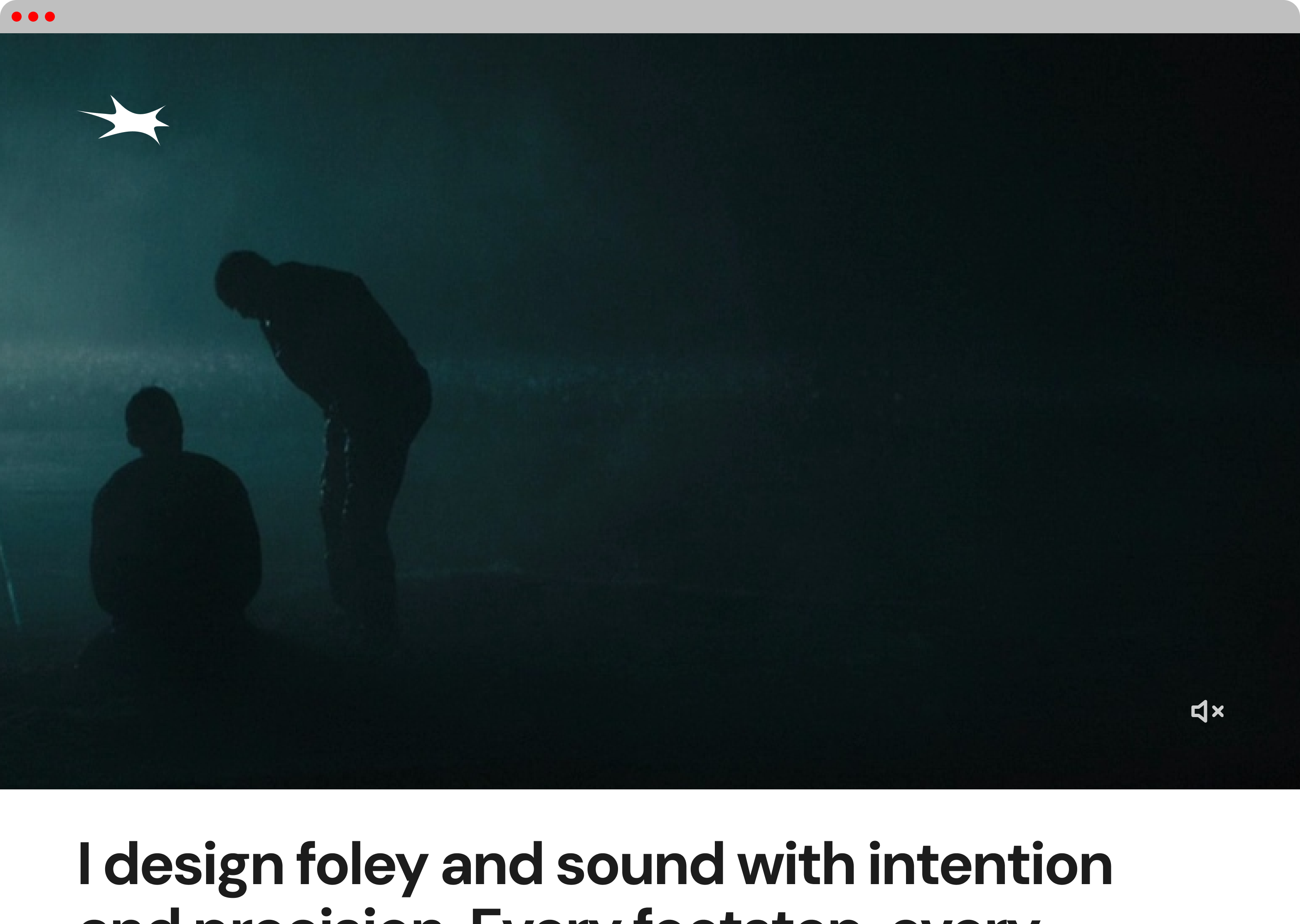
TCS yearned for a visual identity built around the physical expression of sound.
The brand explores how abstract form can capture impact, movement, and restraint. Sharp edges and compressed shapes combine to create a mark that feels like a single, controlled bang. This was inspired from foley design, where artists use every object around them to create the perfect pop.
Designed to function entirely in black and white, the identity relies on contrast and silhouette to do the work. This ensured the mark remains bold, flexible, and legible in any context or colour application.
The result is a stripped-back system that cuts through excess, allowing form and intention to speak clearly, without noise.
Next Project
Parade Tattoo Parlour